


COLOR 101
- Naimah bint Lukman
- Sep 19, 2020
- 3 min read


Over the years I have noticed that there are a lot of people who struggle with matching colors. If you fall into this category, then this post is for you.
It saddens me to see people dress in certain ways which are not so lovely. Hence, I have decided to start these colors series post to help serve as a guide to anyone mostly ladies my age range. This is only an introductory post and I’m going to be having several subsequent posts to help you with matching colors right.
I’m not going to bore you with unnecessary details or defining color. I’m going to go straight to the point. Starting with this quote.
“Mere color, unspoiled by meaning, and unallied with definite form, can speak to the soul in a thousand different ways”
-Oscar Wilde

Color means different things to different people and there is a color for everyone. Before going forward, I want to ask you some questions:
· What is your best color?
· What is it about the color that you love?
· What is your least favorite color?
· What color looks best on you; that color you get the most compliment on when you wear.
· What color is your dream room?
Please drop your answers in the comment section. I want to know.
Like I said earlier, color means different things to different people. Personally, the colors I pick depends on my mood at the time. If you can recall, I talked about how my style can be explorative and daring here. This also applies to my use of color. I find the process of exploring different color schemes very interesting. It is one of my favorite thing to do and I do it well.

Matching colors shouldn’t be too stressful. There are simple principles that you can tweak to suit your personality. As I always advise, know what you love, what works for you and try to be the most stylish you can be. There honestly is no point wearing something that doesn’t make you feel you.
The goal is to be the most stylish version of “you” you can possibly be
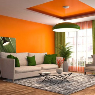
Different colors have their meanings and elude their different moods. Take the design of an interior for instance, if you want a very airy feel or want your room to feel bigger your best bet is white. If you do not like white interiors, then you can also go for grey or very light pastels.


Source: m.domino.com




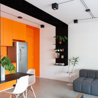
Source: casa.abril.com
Imagine planning on having a dinner date and trying to pick colors for the date. Different colors mean different things depending on how you wear it.
A blue dinner dress depicts royalty (not every shade of blue though), a red dress speaks power, a black dress is classy and so on. But at the same time, these colors have to be used right to avoid looking tacky. This is why it is important to understand colors or at least speak to a color consultant to guide you. You can contact me here, I do consultations.

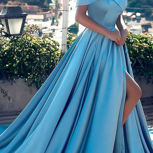


Source: weddingguestguide.com
Color has been and still is a very important part of our lives whether knowingly or unknowingly. Take the street light for instance, it either draws attention or blends with the environment as the case may be. Let me ask you this question. Why do you think the chameleon is significant? Well, it is because of its ability to blend with whatever environment it finds itself. Is that your goal? Do you want to blend in or stand out? Do you want your building to blend in or stand out? It boils down to your choice of color.
The renowned architect Tosin Osinowo designed the poplar black box; the Maryland mall. Although the mall draws a lot of question from different people, I think it serves its purpose which is making a building in form of a silhouette. Although some architects might not agree with it. I think it did justice to the whole idea as it is a major landmark in Lagos state now. The contrast between the all-white interior and all-black exterior of the building is one I find particularly interesting.




Source: @cmd+A
As an architect, having a preconceived idea of the impression you want your building to have on people is a must and color is a very important tool in achieving that although not the only tool. Also, an interior designer needs proper knowledge of color to translate the mood of client wants into a design. Choosing the right color for your outfits go a long way in depicting your mood.
Color in design and fashion is a very broad and inexhaustible topic and I definitely will be talking about it in subsequent blog posts. Please subscribe to my blog so you don’t miss any part of it as this is only an introductory part.
See you next Wednesday!
Love
Naimah bint Lukman
The Fashion Architect

I love colours but don't know how to match them so I rather play safe by sticking with neutral ones
My favourite colours are blue, black,brown, white, and grey
I don't know if it's weird but colours kinda comfort me in a way.
My least favourite colour is red
White looks really nice on me!
Grey and white for my dream room
Colours 😍😍. This is such a beautiful post. The act of matching colours can’t be under rated, it is a necessity. I challenge myself to try colours I have never worn from time to time. I believe everyone should endeavor to style different colours, it sure wouldn’t hurt. 🤪